The ultimate guide to unlocking higher subscriber enrollment rates

Unlocking higher subscriber enrollment rates is all about communicating the convenience and value of the subscription offer. Done right, it can pay off in dividends for years to come.
A large active subscriber base is worth its weight in gold with their potential to increase average customer lifetime value (LTV) by a staggering 250%. For most eCommerce and retail brands, that kind of LTV growth alone is reason enough to double down on initiatives that attract more subscribers — but that’s just the start of the positive ripple effects that come from acquiring more subscribers.
Boosting enrollment rates with an optimized subscription offer is the first step towards turning an eCommerce business into a well-oiled profitable growth machine. That’s why we put together this guide covering Ordergroove’s proven best practices for growing subscriber enrollment rate by up to 577%, with tactics like:
- Optimizing subscription offer visuals and messaging to make enrollment a no-brainer
- Making subscriptions the default purchasing option on product pages
- Crafting a high-converting subscription landing page
- Promoting the subscription offer throughout the shopping experience
- And turning the shopping cart into another conversion pathway to maximize enrollment
Don’t know your subscriber enrollment rate?
Learn how to calculate it in this lesson from Ordergroove Academy before we dive in.
1. Optimize visuals and messaging to make enrollment a no-brainer
Studies show time and time again that visuals are the most effective way to convey a message. 90% of information transferred to the brain is visual, and visuals are processed 60,000 times faster in the brain than text. Yet, many merchants underestimate the impact that the visual style of their subscription offer can have on enrollment rates.
Of course, brand guidelines vary, so this will look different in practice for every merchant — but there are some universal best practices when it comes to visualization and messaging to keep in mind so you develop a subscription offer that’s too good to pass up:
Highlight the value of subscribing
In this economy, emphasizing the value and cost savings of your subscription offer is one of the best ways to resonate with potential subscribers.
Visual tactics like highlighting the percent off discount, displaying strikethrough pricing, or adding a visual callout for the total amount saved are all great ways to help shoppers grasp why subscribing offers better value than a one-time purchase.
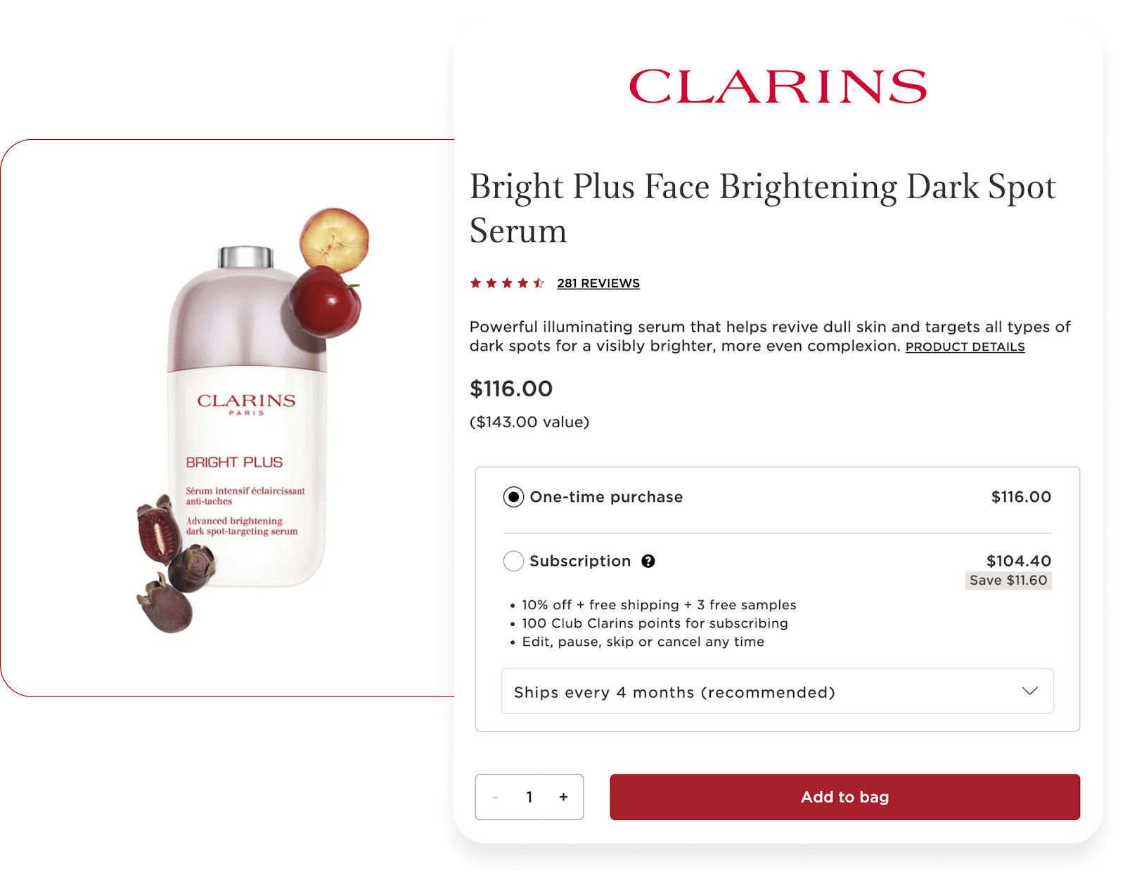
Clarins clearly highlights potential savings for subscriptions and calls out all relevant benefits of their replenishment offer; including discounting, shipping, samples, and loyalty rewards.
Make the subscription offer stand out from one-time purchase options
It may sound obvious, but simply displaying a subscription offer above a one-time purchase option can have an outsized impact on enrollment rate — especially when it’s styled to be the most eye-catching offer.
According to an A/B Test of 13 Ordergroove merchants, placing the subscription offer above the one-time purchasing option resulted in an average 11% lift in enrollment rate, with some merchants experiencing up to a 63% lift.

To maximize the impact, use differentiated visuals for the subscription offer. Simple tactics like showcasing the subscription purchasing option in a contrasting color box — and incorporating bold font in the surrounding copy — ensure shoppers won’t overlook the opportunity to subscribe.
Use simple UX and messaging to convert more subscribers
When it comes to enrollment, the simpler the experience, the better. It’s always best to streamline the enrollment process down to as few clicks as possible — like presenting the subscription offer to shoppers with a pre-selected radio button, rather than expecting them to click an additional checkbox.
One extra click may sound trivial, but it can be the difference between an order realized and one lost — so, it’s best to make the path to enrollment as simple as possible.
With a simple path to conversion in mind, keeping shoppers on the product page where they can easily enroll is mission critical — so, merchants should take advantage of prime real estate for persuasive messaging right on the product page to address any hesitation about subscribing.
For example, showing an appropriate default order frequency within the subscription offer can ease shoppers’ fears of ending up with more product than they need. But it’s also worth including messaging like “Skip, pause, or cancel anytime” to reassure shoppers that they have the ability to easily manage their subscription.
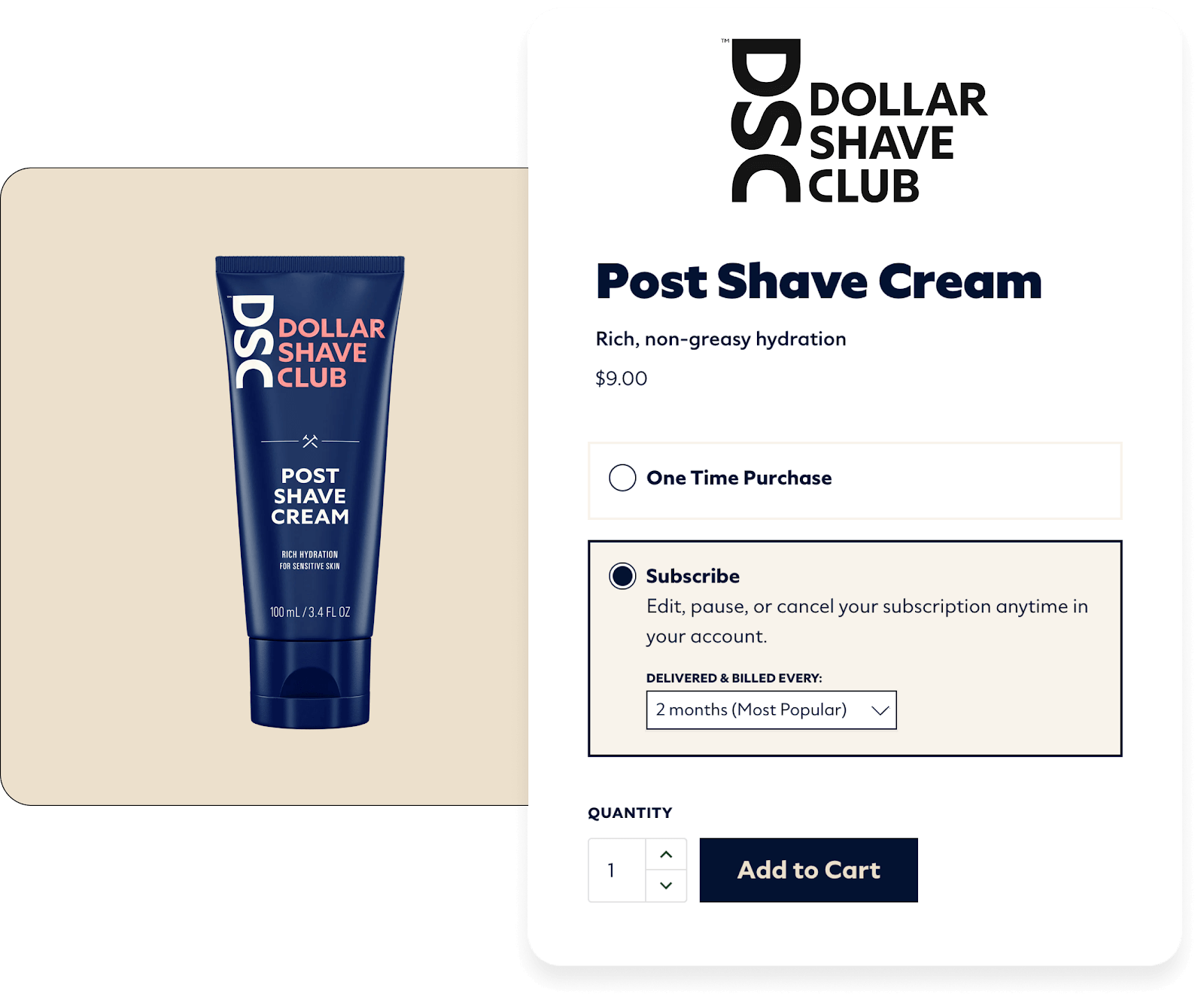
Dollar Shave Club makes it clear that their subscribers can modify their subscriptions on their own terms.
2. Make subscriptions the default purchasing option on product pages
The average shopper will only spend around two to five minutes on a retailer’s site, which doesn’t give merchants much time to communicate the value of their subscription offering. With every additional action or obstacle that stands in the way of purchasing, conversion outcomes start to dwindle — so, fewer clicks increase the likelihood of conversion.
Making subscriptions the default purchase option immediately highlights the most valuable offer, and makes it easier for customers to opt in than to opt out. This helps brands make the most of those precious minutes — and can even drive a five times higher enrollment rate.
But which products make sense for defaulting to subscriptions? Understanding subscriber motivations and A/B testing how products perform are the key to choosing the right ones.
Choosing the right products for defaulting to subscriptions
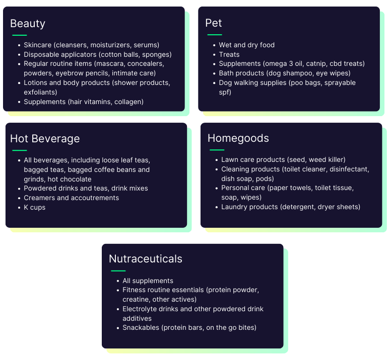
It stands to reason that the evergreen and best-selling subscription products in a merchant’s catalog — and especially those geared towards auto-replenishment — are most likely to perform well when subscriptions are the default purchasing option.
Some popular examples of auto-replenishment products for different verticals are below.
A/B test product performance for defaulting to subscriptions
To be sure defaulting to subscriptions is driving higher enrollment for the selected products, merchants should A/B test individual product performance before and after making the change on-site — and continuously track their subscription analytics relative to industry benchmarks like the ones below.
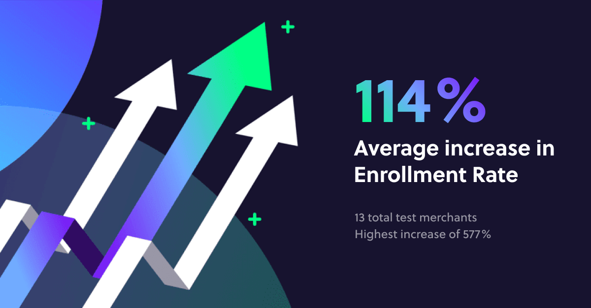
Among Ordergroove merchants who were early adopters of defaulting to subscriptions, enrollment rates increased by up to 577% with an average lift of 114% when A/B tested over a period of 30 to 90 days. The incremental increases ranged anywhere from 26% to 577%, with 13 total merchants representing beauty, appliances, coffee, pet, health, and retail.
Worried about accidental sign-ups?
Learn about net enrollment counts in this lesson from Ordergroove Academy to understand why defaulting to subscriptions drives a meaningful increase in net enrollment rate regardless of related cancellations.
3. Craft a high-converting subscription landing page
A great subscription landing page will increase awareness for the subscriber experience, proactively address questions to minimize hesitation about enrolling, and educate potential subscribers about the full value of the subscription offering.
Lead with subscriber benefits
Turning shoppers into subscribers requires a strong value proposition, so a great subscription landing page should begin by addressing exactly what’s in it for them and why they should subscribe.
We’ve established that cost benefits are a major motivation for subscribers, so quantifying the real savings customers will unlock with subscriptions is a great place to start.
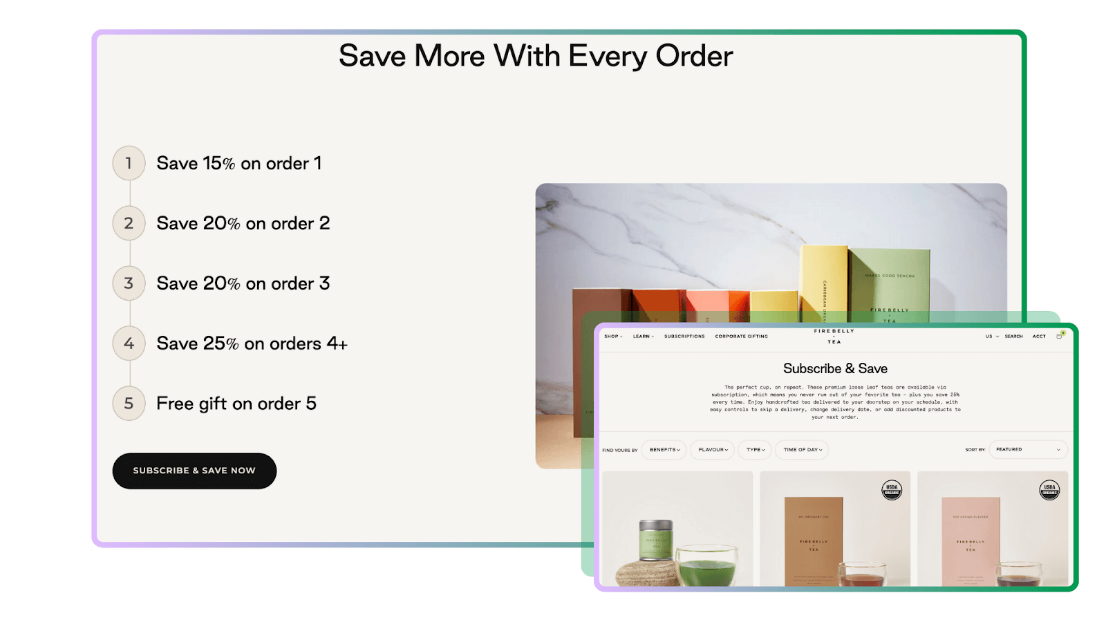
Firebelly Tea uses their subscription landing page to call out their tiered discount incentives — and a free gift on the fifth order — to show subscribers the cost benefits of staying enrolled.
Beyond just the financial benefits, a great subscription landing page should also highlight the full range of perks that come with the subscriber experience — from the convenience of flexible order modifications and product swapping, to memorable experiences like exclusive deals and early access to new items.
Proactively answer FAQs to address subscriber hesitation
A dedicated subscription landing page is the perfect place to lay out all the details about subscription management to remove any shadow of a doubt for potential subscribers — think: mentioning the ability to SKU swap, delay or skip an order, or update the delivery frequency going forward.
To make sure no potential subscriber concern goes unchecked, merchants should make sure their subscription landing page addresses the most common FAQs below:
- How do I subscribe?
- How does my subscription work?
- Can I cancel my subscription at any time?
- Can I skip or pause upcoming subscription orders?
- Can I change my subscription shipping frequency or quantity?
- Will I get order reminders?
- Can I stack flash or holiday sales with my subscription discount?
- How do I update my subscription billing or shipping information?
- Can I add items to my upcoming orders?
- What if my payment method expires or I forget about my subscription?
Looking for inspiration to craft the perfect FAQ answers? This lesson from Ordergroove Academy has got you covered.
Feature shoppable CTAs and subscriber social proof to drive conversions
Incorporating shoppable banners and CTA pages to drive traffic to subscription and upsell-eligible can turn a subscription landing page into a reliable engine for conversions. Studies show that shoppers appreciate personalization and product suggestions, with 35% of Amazon purchases resulting from the recommended products section — and merchants can tap into this by featuring best-selling subscription products on their subscription landing page.
To effectively drive conversions, a subscription landing page also has to establish trust with potential subscribers — and embedding real subscriber reviews is a great way to do it.
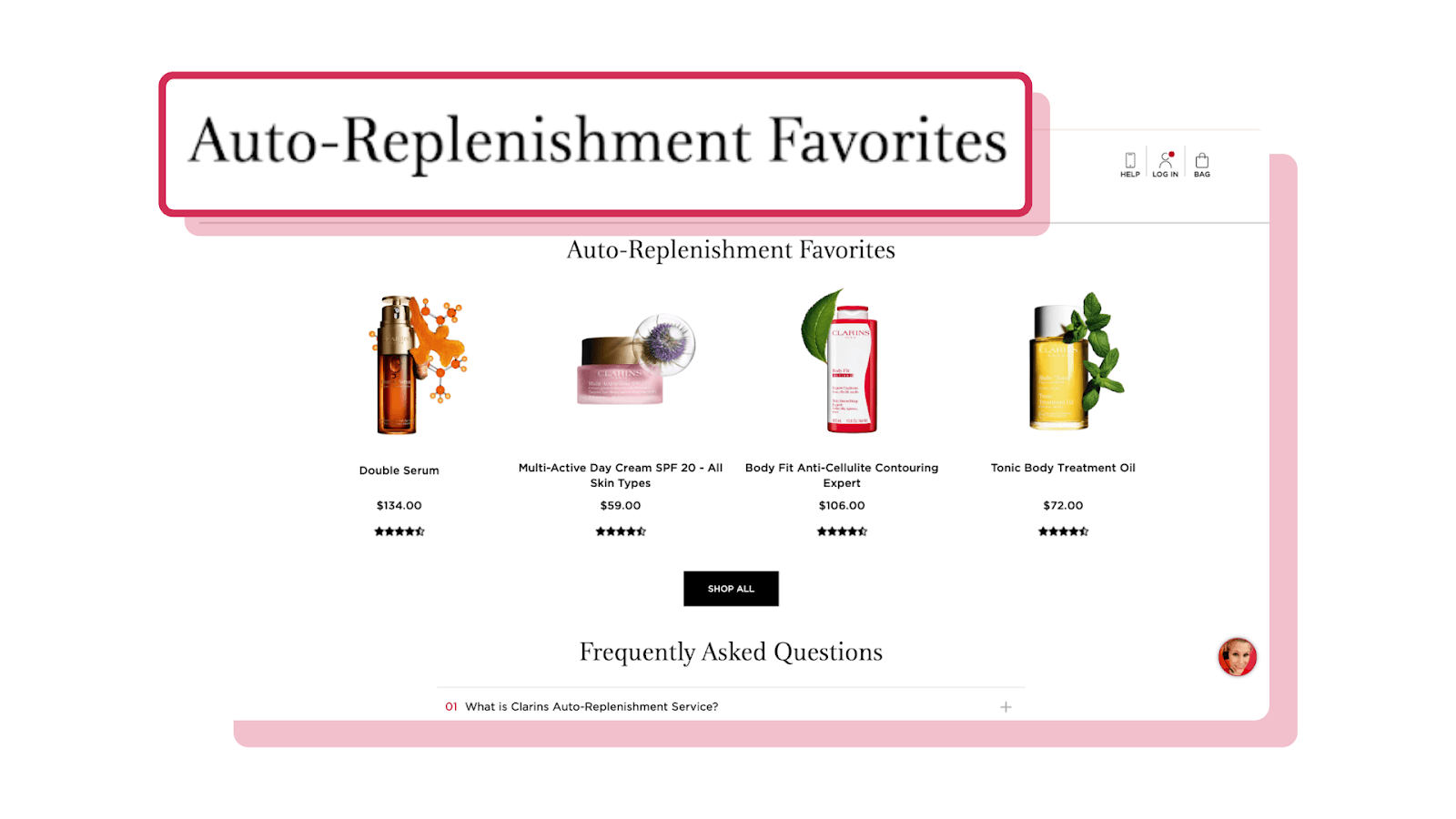
Clarins leverages the power of product recommendations by highlighting their most popular auto-replenishment products on their subscription landing page.
4. Promote the subscription offer throughout the shopping experience
Retail benchmarks show that eCommerce conversion rates can fluctuate based on industry, device, and overall site traffic — so to successfully grow their subscription enrollment rate, it’s on merchants to make every site visit count. The secret is optimizing the entire shopping experience on-site to promote subscriptions.
Getting it right requires not only an understanding of the channels driving traffic, but also the types of shoppers coming from them. Whether site traffic is coming from organic or paid search, social media, emails, or display ads, potential subscribers can land on different areas of the website — and it’s worth boosting subscription visibility across each one of them.
Start with a subscription CTA at the very top of your website
Finding the right CTA message and placement is mission critical for maximizing subscription enrollment — and displaying one in the main site navigation is a great way to ensure it’s visible to site visitors no matter which page they land on.
To attract the site visitors who are most likely to be interested in the subscription offer, it’s best to use a CTA that speaks to a core value of the subscriber experience.
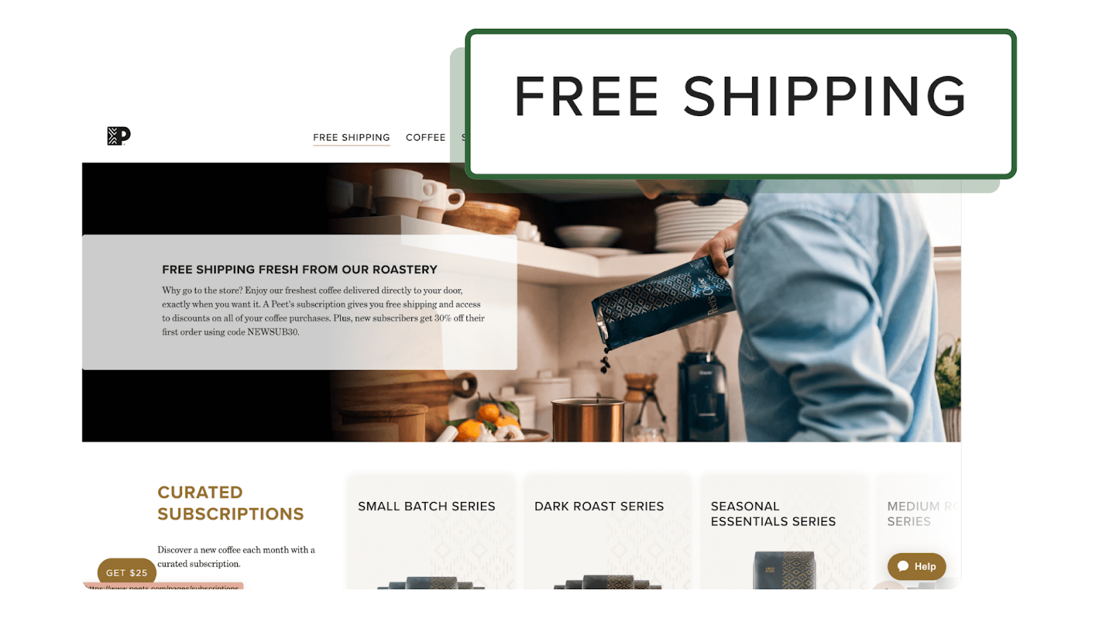
Peet’s Coffee entices potential subscribers with a “Free Shipping” CTA in their main site navigation to drive traffic to their subscription landing page.
Call out the subscription offer on category pages
According to a McKinsey study, product recommendations work best when site visitors are in “shopping mode” — and merchants can use that to their advantage by displaying subscription promotions on every collection and category page where site visitors are actively considering a purchase.
Incorporating visual iconography for subscription products on collections and category pages is another subtle yet effective way to get shoppers thinking about subscriptions when they’re considering their next purchase. Something like a simple and recognizable autoship icon or a “subscribe and save” badge on relevant products.
5. Turn the shopping cart into another opportunity to enroll
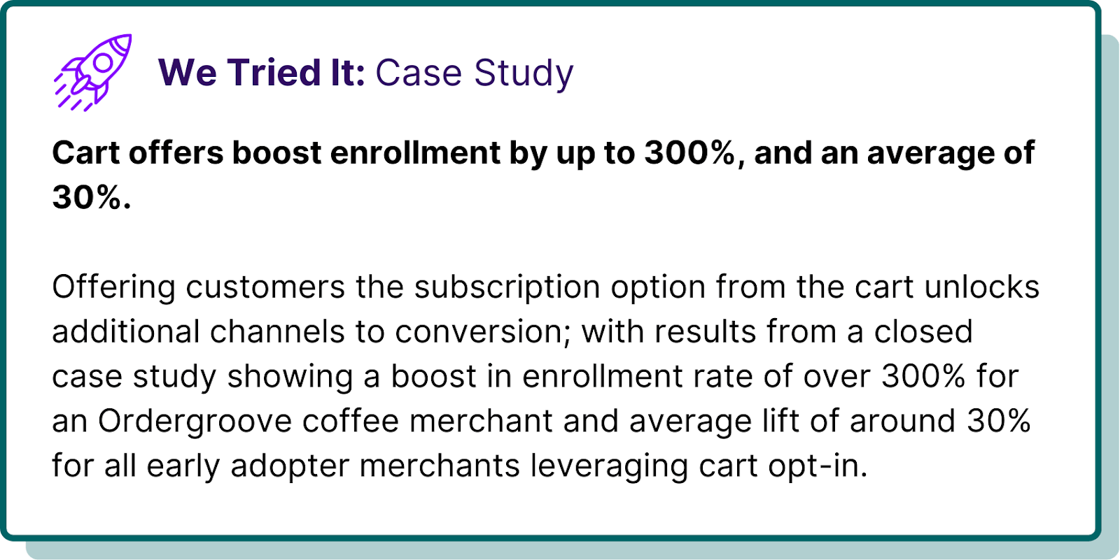
Getting a site visitor all the way to the shopping cart is an achievement in its own right — but too many merchants overlook the golden opportunity to turn those customers into subscribers with an enrollment offer right in their shopping cart.
For example, repeat customers who routinely breeze through checkout to buy the same product might be missing the subscription offer altogether. This is the exact type of customer who’s likely to be interested in the subscriber experience, and cart offers are an effective way to get subscriptions on their radar before it’s too late.
Simplify the cart offer for more conversions
Similarly to the subscription offer on a product page, cart offers can be displayed as either a radio button or checkbox. Ordergroove data has shown that opting for a radio button is a best practice in this context, too.
User experience testing has proven that radio buttons minimize cognitive load, making the purchasing experience simpler and less stressful for the customer by letting them easily compare and contrast their choices.
The best practices for visually styling an enrollment offer on the product page apply to the shopping cart, as well.
To learn how to optimize cart offers for checkout experiences like full page, side panel, and modal shopping carts, don’t miss this lesson from Ordergroove Academy.
Supercharge subscription enrollment to tap into the next era of profitable growth
In a time when the subscription market is expected to grow from $199.41B in 2023 to $330.58B in 2024, boosting enrollment should be top of mind for every merchant. Right now, there’s an unprecedented opportunity for brands that optimize their subscription offer to kickstart recurring revenue growth with reliable, predictable cash flow.
Brands who miss the opportunity to drive higher subscription enrollment in a favorable market will leave revenue on the table. It’s simple — higher enrollment rates directly improve the LTV to CAC ratio, improving the ROI of customer acquisition efforts. And a growing pool of repeat customers gives brands a captive audience to cross-sell and upsell over time, further improving LTV.
It all starts with higher enrollment rates — and to that end, Ordergroove is here to help.
Ready to join the leading brands using Ordergroove to supercharge enrollment rates with a winning subscription offer? Let’s chat.